# Import modules.import numpy as npimport matplotlib.pyplot as pltimport pandas as pdimport seaborn as sns# Set formatting for Seaborn.sns.set_theme(style="ticks")sns.set(rc={'figure.figsize':(4,4)})sns.set_style("white")# Load datatable from csv file.df_AMI_HHall = pd.read_csv("./data/AMI_over_time,_Santa_Clara,_HHall_long.csv")# Plot the lines on using facets.rp = sns.relplot( data=df_AMI_HHall, x="Year", y="Income ($)", hue="Level", col="Household size", kind="line", col_wrap=2, height=3, aspect=.90, facet_kws=dict(sharex=False),)# Adjust the spacing in the figure.rp.fig.subplots_adjust(top=0.85) # Add a title for the facetgrid chart.rp.fig.suptitle("Stanford Minimum Postdoc Salary and Area Median Income\n for Santa Clara County over time", fontsize=16)# Show the plot.plt.show()
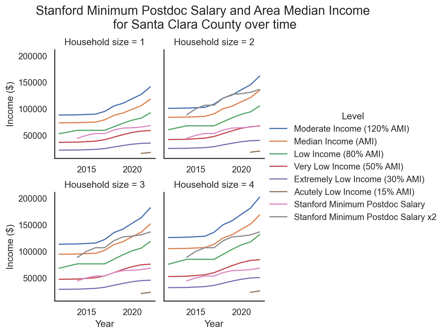
Figure 1: Comparison of Stanford Minimum Postdoc Salary with Area Median Income (AMI) levels for Santa Clara County (the county in which Stanford is located), including federally defined (by the Department of Housing and Urban Development, HUD) definitions of Moderate, Median, Low, Very Low, and Extremely Low Income. Twice the Postdoc Minimum Salary is also included in graphs for households of 2 or more persons. Sources: California HCD, Office for Postdoctoral Affairs and email correspondence. Refer to Appendix D: Data Tables for raw data used to prepare this graph.